Why should you bother with a customized background image for twitter? Don't most people manage their twitter accounts with programs like TweetDeck and so on? Yes, but still, if someone clicks your "Follow Me on Twitter" link, they will land on that page. So you want to make a good impression if you want followers.
[By the way, I just drew this little Twitter bird on Gimp. I think it's an okayish Twitter bird. If you want to use it, go ahead, just give me a link from your blog, follow me on Twitter, or buy me a cup of coffee one day. I believe it is a African Scops Owl crossed with a cross between an Angolan Pitta and Crimson Breasted Shrike. I see those all those time :) ]
[Okay, sorry for the distraction, lets get back to the serious busyness of producing a fine Twitter Background Image]
This guideline is a simple step by step way of doing it. Note, I am doing this on Ubuntu Linux and the tools I use may not be what you have, but none of them are hard to get by, basically I just use a browser, a screenshot thingi (to take a picture of your screen), and a graphics editor.
Before we get started, have a look at some of the amazing twitter backgrounds that people have produced. I will show you a step by step way of doing it, but I can't tell you how to make it artistically outstanding, that's up to you. Take a look at this link: http://twitterbackgroundsgallery.com/
1. Open your twitter account as it is now.
2. Okay, the biggest challenge with your twitter background is the fact that it sits behind your main twitter screen, and only overlaps on the sides. This means that you want your most improtant information to stick out of the sides. In order to make sure that even people with really small screens are getting this, first resize your screen to about 1024 width and 768 height. If you don't know how to do this, there is one rather simple way, just use Javascript.
Here is the majic: Just type this little line in your navigation bar at the top of your screen: javascript:window.resizeTo(1024,768)
Hit enter and you should have a really small screen.
3. Now use a screenshot tool to take a screenshot of your twitter page in this small resolution.
4. Open your favorite Graphics Editor program. You want to make sure that the program you use allows you to use layers, so most lightweight programs will not do. I use Gimp, which is a very good open source graphics editor. If you don't have Adobe Photoshop or something in that league, I recommend that you download Gimp
5. I am going to carry on with the explanation in Gimp, but I am sure that you will figure out how to do it in your own program. Create a new image. It doesn't matter if you set the background to white or transparent. Create a picture that is 1280px times 1024px (px being Pixils)
6. Now comes the more tricky part. You need to go 'open as layer' or whatever the equivalent is in photoshop, and select the screenshot of your twitter account on the smaller screen, and open it.
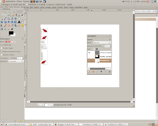
7. Use the 'align' tool to set the twitter image to the top left side. It should look something like the image below.
8. Okay, the only real reason for having the upper image is to show us what area we have for our text. So, staying in this layer, use a 'rectangular select' tool and select the area on the left of the main twitter content. This is where you want to write your stuff.
9. Create a new layer. In gimp you will still maintain the selection in the new layer.
10. Now, you probably don't want to maintain the selected area, so a simple thing to do is to simply go "Select" and click "invert selection" Now use your fill tool and color the remaining area into one solid color. This color doesn't matter...it's not going to be your background. It is simply there to show you the remaining space that you have to work with.
11. Go to your "layers" dialog box and make the old twitter layer invisible.
12. Now you can work in the white layer doing whatever you want. You may want your name, blog url, a bit about yourself or just some pictures. Be creative. Keep in mind roughly how big that space is going to be after you are done. Also keep in mind that you don't want to fill the background, because you will still be putting a picture or a background fill behind it.
[More bird drawing inspiration, and this time it really does have Angolan Pitta in it somewhere.]
13. Once you have it as you want it on that space, take the fuzzy select tool and select the black space. Press delete.
14. Now go on the 'layers' dialog box and select the original background layer.

15. With this 'background' layer selected you can either put an image in there or simply create a fill with colors. Anything you want. Take a two things into consideration
a. Does it not wash out the dialog created in the other layer.
b. Make sure that it is an image that doesn't matter if a little of it is chopped off, because of the way that gimp resizes on different size screens. Blue sky, open water, or stuff like that. Color and texture.
16. Now it really depends on how your system works, but the best way to do it is to select the layer that had the origional picture you took of your Twitter page and, once you have selected it, go to "layers" and press 'delete layer'.
17. Now click on the top layer again, and go to 'layers' again and press 'merge down' until your whole image is flattened. This is not always necicary, but remember you want this to be on the internet, so you dont' want to keep to much data in the image (in other words, make is smaller in file size).
18. Now Twitter is only going to give you an image size of 800k. You may need to play around a bit to get that right. On Gimp you can go to the Image properties and check it out.
19. Save As, choose your name and file type. I think that with jpg you get the file size you need more easily.
20. Go back to your twitter account. Click on "Settings" and then "Design" Go down to the bottom of that page and click the "Change Background Image"
21. Easy from here. Click 'Browse', find the image on your hard drive and click ''save changes".
22. Now have a look at what it looks like when it uploads. Can you read the text, how does it scrole. Go back an make changes and upload again until you are happy.
23. Go to the 'change colors' settings and change the colors as needed to match your background. You may want to copy and paste the html color values from Gimp in order to get the color values spot on.
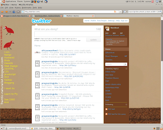
[You can see what I came up with after playing around a bit. I used a picture of an old dune. I played around with text sizes and colors until I got something people can read when they hit on my page.
Well, thats how I had done it. Anyone with tips or ideas to share, please feel free. I hope it works for you.
If you are looking for similar tutorials, you may be interested in one of these:
Hide Your Blogger/Blogspot Navbar - Fun blogger hack
Auto-update Your Websites Copyright Dates Each Year - Be a pro
Create And Add A Favicon To Your Website - Easy fun way to improve your website's look
Make Your Main Body Wider In Blogger - With increasing use of wider screens for computers, you may want more space to add your main blog content


